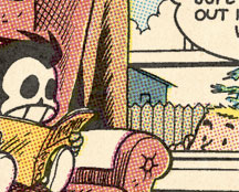
 Just reposting the image to remind you how terrible it looks! Fortunately, this is an easy fix.
Make sure you haven’t deselected or done anything else since you hit delete, then just go up to the Edit/Fade Fill menu, and you’ll get this dialogue box:

If you’ve changed anything since the fill, you may not be able to access this menu, and that’d be a shame, wouldn’t it?
You may want to play with the opacity controls a little bit until you’re happy with it. For this project, I settled on 35%. Now we need to do the same for the colors, since they’re still far too bright for this paper.
Make sure you still haven’t deselected anything, then go back into Quickmask mode. You should have the same texture you had before you faded the black linework. If you did deselect, you can either go back through the history, figure out where you did it, erase that step, and get back to this point, or you can just repaste the newsprint and adjust the levels again.
 Now, the thing is, we don’t want to have the colors faded in the exact same pattern as the linework, do we? That’ll just look fake. I certainly don’t want this to look fake, and if you do, I don’t think we can be friends any more. So what we need to do is select the entire image using command-A (or CTRL-A on PC, I assume) and then rotate it 180 degrees. This is easily accomplished by accessing the Edit/Transform/Rotate menu, then selecting a 180 degree rotation in the little angle box at the top of the screen:

This’ll just flip the selection over, so it’ll have a slightly different texture when we exit Quickmask, which we’ll do now. Then just select the cyan, magenta, and yellow layers (making sure you don’t have the black layer selected) and hit delete again. Once again, the fade will be greater than you really want, so we go back to the Edit/Fade Fill menu again, and set the opacity to somewhere around 75%. You want the colors to be a little less faded than the linework.
Assuming everything worked out the way you intended, you should have a piece that looks something like this:

If you’d like a closer look at what the texture and dots and everything look like, here you go! If you don’t, well, the heck with you.

I have a more complicated method that cuts out the color halftone step and replaces it with building one’s own colors out of scanned halftone film, but that’s a little more complicated than I really want to get into here. This way should do the job 95% of the time, anyway. How authentic do you really need to get?
Okay, that’s it. You’ve learned how to color like a little old lady. I hope you’re proud of yourself, putting those poor old grandmothers out on the street like that.


Comments are closed.