


 Here’s the part you were actually interested in reading: how to get all those nifty stress marks!
To start, we need to fade the colors a little. Who ever saw an old, battered paperback with a crisp, unfaded print on the cover? No one, that’s who! So we’re going to create another new layer and fill it with 25% yellow. The we’ll just set the opacity of the layer to 25% by clicking on the little opacity menu in the top left there, and we end up with this:
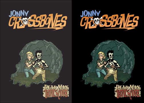
I put the faded cover next to the original so you could see the difference. It makes it look a little warmer.
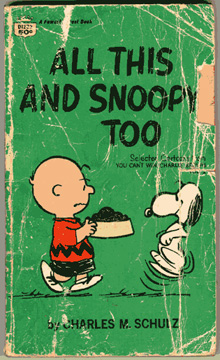 Now, the way I got those stress marks was just by scanning this old paperback Peanuts collection I happened to have on the shelf next to my computer. I scanned it in at 800dpi, which is much higher resolution than I’m ever really going to need, but it allows me the flexiibility to stretch it out over whatever size book I might need to. Using the Magic Wand with a pretty high tolerance, I just selected all of the yellowy stress marks. Once I had them all selected, I just went to Selection/Inverse, and then deleted the rest of the image and set it to grayscale, leaving me with this:
![]()
You can see around the edges where I did a little touchup with the brush tool, making sure the edges weren’t too sharp. It has to look frayed to the edge of the cover, not just having an edge printed further into the image. Once we have this transparency put together, it’s an easy matter to just copy and paste it onto our image. That gives us this:

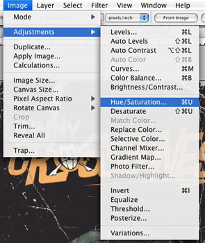 That looks pretty good, but since all the stress marks are gray, it doesn’t look completely authentic. Fortunately, it’s easy to make those marks look like yellowing paper. Just go up to the Image/Adjustments/Hue/Saturation menu. That’ll bring up this window, which you can play with until you’re happy with the results:
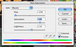
If you look closely, you can see the extremely masculine picture of pretty flowers I have set as my wallpaper. Anyway, I just increased the saturation by a good bit, then played with the Hue slider until I was pretty happy with the color, and increased the Lightness just a touch. I ended up with this:

You can clickon that for a much larger version if you’d like, but that’s pretty much the whole thing. Hope you enjoyed this tutorial! Let me know if I’m doing anything else you’d like to see explained. These are kind of fun to write.
Comments are closed.