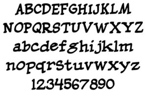
Lettering
I’ve done a long-needed overhaul on the font I made to letter this comic– I’ve gone back and relettered pages 81 to current, so hopefully they’ll be more easily readable now. I think this new typeface looks much better, and I’ll be getting to all the pages eventually. It’s slow work and I’ve got other stuff to do!
(The font is called “Crosswords” and I’m up to version 4.0 now.)


This is what version three looks like, if you’re interested: http://jonnycrossbones.com/wp-content/uploads/2016/06/Screen-Shot-2016-06-18-at-10.25.21-PM.jpg
Ooo. Nice. I like version three, but can see why you updated. Version 4 is snazzy, quicker to read & I imagine fits a little bit more naturally in word balloons/speech bubbles.